Graphic Design
re:WORK Training
A Chicago nonprofit that trains people without college degrees for tech sales jobs, free of charge. I built their 2024 Impact Report, fact sheets, infographics, LinkedIn content, presentations, and internal training materials.
Year :
2025
Industry :
Non-profit Organization
Client :
re:WORK Training
Project Duration :
5 months

Problem :
re:WORK had a brand identity before I got there. Full logo lockup, color palette typography and more — the foundational work was done. What they didn't have was a way to apply it consistently.
Every deliverable had been built one at a time. A fact sheet here, a slide deck there, each solving its own layout problem from scratch. Put side by side, they didn't look like they came from the same organization. And none of it was built fir the audience it had to reach.
Solution :
re:WORK's premise is that people without degrees are worth hiring. Scrappy materials would have argued against that, making the program look like charity and the candidates look like a lesser tier. It had to look like the industry these candidates were entering, not the sector paying for it.
So I committed to three things.
Look like the destination. Tech, not nonprofit. Confident color, generous type, photography that could sit on a company careers page.
Treat clarity as respect. Anything a reader has to work at implies they should have known already, and these are people who have been screened out before.
Put real people on the page. The argument is about specific individuals, so the pictures are of specific individuals.


Challenge :
One of the main challenges is achieving a seamless blend between the spiral’s organic curves and the digital medium’s precision. The artwork must avoid appearing too mechanical or artificial, instead highlighting the natural, fluid qualities of the spiral.
Another challenge is ensuring the coral color remains vivid and harmonious with the background gradient, avoiding any visual clash or loss of contrast. Maintaining visual interest without overcrowding the composition is also essential.
Summary :
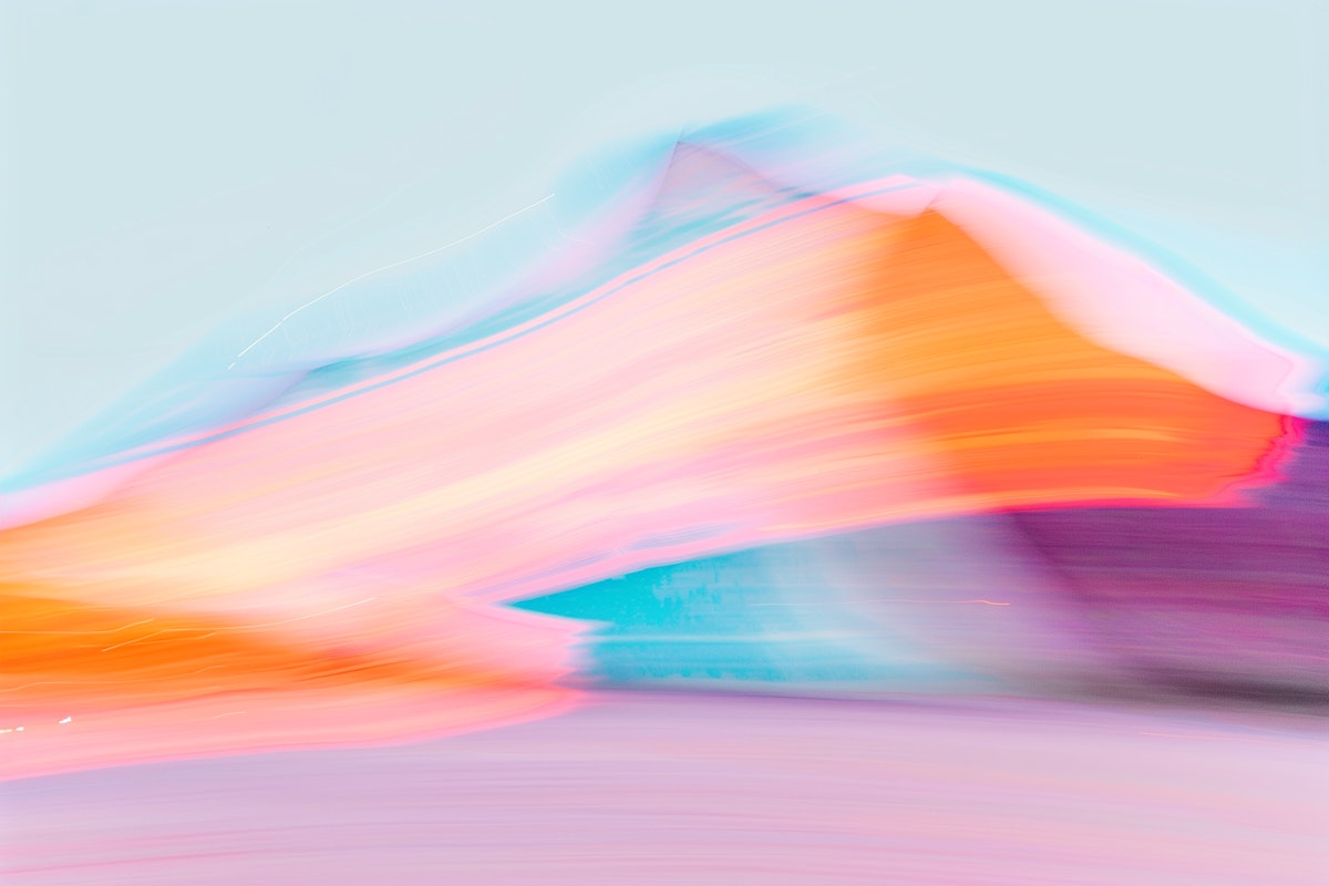
"Coral Spiral Abstract" is a visually striking 3D artwork that fuses modern digital aesthetics with organic forms. Through the interplay of a coral-colored spiral and a soft pink gradient background, the piece delivers a sense of movement, warmth, and sophistication.
This project demonstrates how thoughtful use of color and form can create digital art that is both contemporary and emotionally engaging.

More Projects




Graphic Design
re:WORK Training
A Chicago nonprofit that trains people without college degrees for tech sales jobs, free of charge. I built their 2024 Impact Report, fact sheets, infographics, LinkedIn content, presentations, and internal training materials.
Year :
2025
Industry :
Non-profit Organization
Client :
re:WORK Training
Project Duration :
5 months
Problem :
re:WORK had a brand identity before I got there. Full logo lockup, color palette typography and more — the foundational work was done. What they didn't have was a way to apply it consistently.
Every deliverable had been built one at a time. A fact sheet here, a slide deck there, each solving its own layout problem from scratch. Put side by side, they didn't look like they came from the same organization. And none of it was built fir the audience it had to reach.
Solution :
re:WORK's premise is that people without degrees are worth hiring. Scrappy materials would have argued against that, making the program look like charity and the candidates look like a lesser tier. It had to look like the industry these candidates were entering, not the sector paying for it.
So I committed to three things.
Look like the destination. Tech, not nonprofit. Confident color, generous type, photography that could sit on a company careers page.
Treat clarity as respect. Anything a reader has to work at implies they should have known already, and these are people who have been screened out before.
Put real people on the page. The argument is about specific individuals, so the pictures are of specific individuals.
Challenge :
One of the main challenges is achieving a seamless blend between the spiral’s organic curves and the digital medium’s precision. The artwork must avoid appearing too mechanical or artificial, instead highlighting the natural, fluid qualities of the spiral.
Another challenge is ensuring the coral color remains vivid and harmonious with the background gradient, avoiding any visual clash or loss of contrast. Maintaining visual interest without overcrowding the composition is also essential.
Summary :
"Coral Spiral Abstract" is a visually striking 3D artwork that fuses modern digital aesthetics with organic forms. Through the interplay of a coral-colored spiral and a soft pink gradient background, the piece delivers a sense of movement, warmth, and sophistication.
This project demonstrates how thoughtful use of color and form can create digital art that is both contemporary and emotionally engaging.
More Projects
Graphic Design
re:WORK Training
A Chicago nonprofit that trains people without college degrees for tech sales jobs, free of charge. I built their 2024 Impact Report, fact sheets, infographics, LinkedIn content, presentations, and internal training materials.
Year :
2025
Industry :
Non-profit Organization
Client :
re:WORK Training
Project Duration :
5 months
Problem :
re:WORK had a brand identity before I got there. Full logo lockup, color palette typography and more — the foundational work was done. What they didn't have was a way to apply it consistently.
Every deliverable had been built one at a time. A fact sheet here, a slide deck there, each solving its own layout problem from scratch. Put side by side, they didn't look like they came from the same organization. And none of it was built fir the audience it had to reach.
Solution :
re:WORK's premise is that people without degrees are worth hiring. Scrappy materials would have argued against that, making the program look like charity and the candidates look like a lesser tier. It had to look like the industry these candidates were entering, not the sector paying for it.
So I committed to three things.
Look like the destination. Tech, not nonprofit. Confident color, generous type, photography that could sit on a company careers page.
Treat clarity as respect. Anything a reader has to work at implies they should have known already, and these are people who have been screened out before.
Put real people on the page. The argument is about specific individuals, so the pictures are of specific individuals.
Challenge :
One of the main challenges is achieving a seamless blend between the spiral’s organic curves and the digital medium’s precision. The artwork must avoid appearing too mechanical or artificial, instead highlighting the natural, fluid qualities of the spiral.
Another challenge is ensuring the coral color remains vivid and harmonious with the background gradient, avoiding any visual clash or loss of contrast. Maintaining visual interest without overcrowding the composition is also essential.
Summary :
"Coral Spiral Abstract" is a visually striking 3D artwork that fuses modern digital aesthetics with organic forms. Through the interplay of a coral-colored spiral and a soft pink gradient background, the piece delivers a sense of movement, warmth, and sophistication.
This project demonstrates how thoughtful use of color and form can create digital art that is both contemporary and emotionally engaging.